

ListView
<ListView> is a UI component that shows items in a vertically scrolling list. To set how the list shows individual items, you can use the <template> element.
<ListView :items="listOfItems" @itemTap="onItemTap">
  <template #default="{ item, index, even, odd } : { item: string, index: number, even: boolean, odd: boolean }">
    <!-- Shows the list item label in the default color and style. -->
    <StackLayout>
      <Label :text="item" />
      <Label :text="`Item index ${index}`" />
      <Label :text="`Is event ${even}`" />
      <Label :text="`Is odd ${odd}`" />
    </StackLayout>
  </template>
</ListView>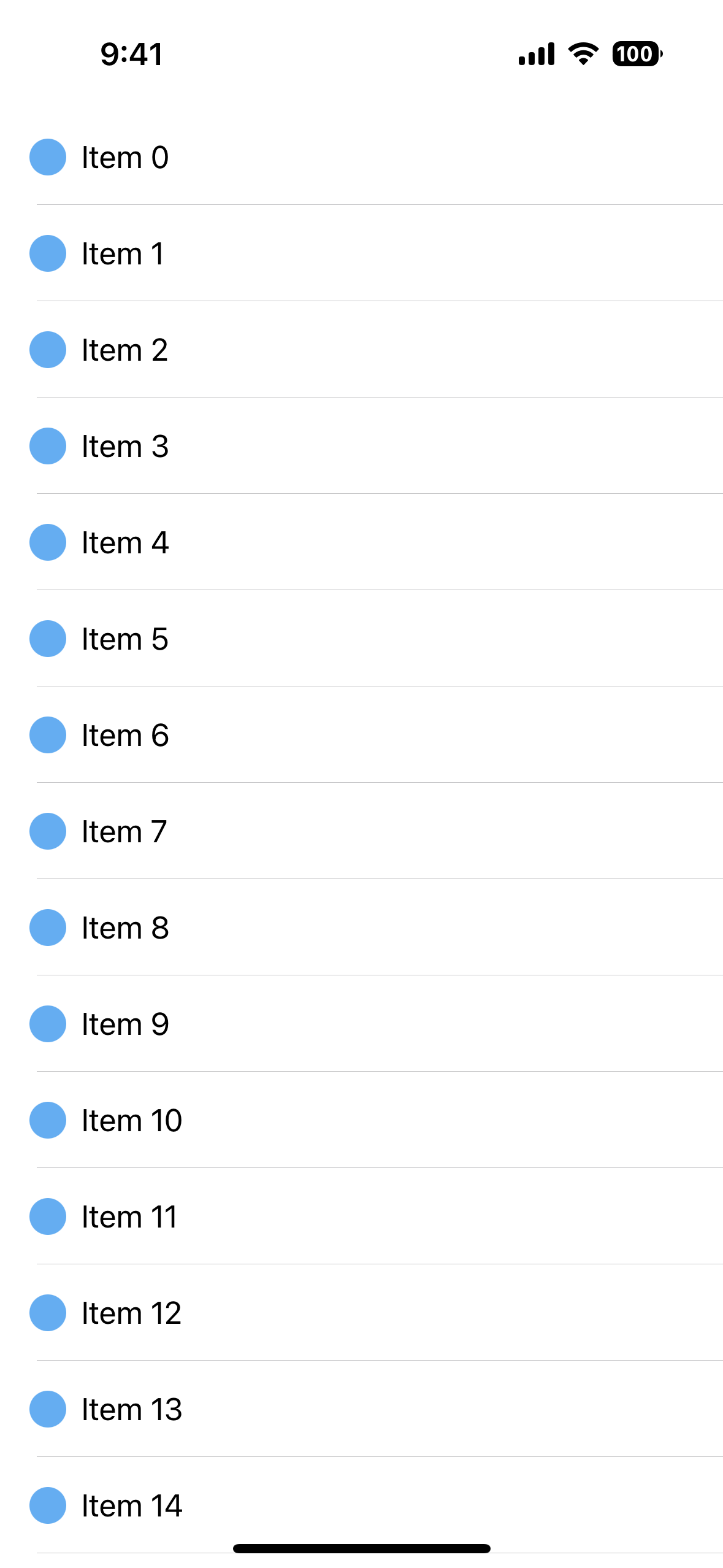
Using <ListView> with multiple <template> slots
The template is used to define how each list item is shown on the screen.
If you need to visualize one or more list items differently than the rest, you can enclose them in additional <template> blocks using v-slot and itemTemplateSelector function.
<script lang="ts" setup>
import { ListItem } from "nativescript-vue";

function itemTemplate(args: ListItem<CustomType>){
  return args.item.type === "header" ? "header" : "default";
}

</script>

<template>
  <ListView
    :items="listOfItems"
    :itemTemplateSelector="itemTemplate"
  >
    <template #default="{ item }">
      <Label :text="item.text" />
    </template>

    <template #header="{ item }">
      <!-- For items with an type header, shows the label in red. -->
      <Label :text="item.text" color="red" />
    </template>
  </ListView>
</template>
An important note
<ListView> only creates the necessary views to display the currently visible items on the screen, and reuses the views that are already off-screen when scrolled. This concept is called view recycling and is commonly used in mobile apps to improve performance.
To use multiple event listeners within a ListView, you can pass in the current item to the listener with @tap="onTap(item, $event)".
Check out this playground with multiple buttons in each ListView cell
If you only need to handle taps on the whole cell, you can use the itemTap event which contains the index of the tapped item and the actual item from the list.
onItemTap(event) {
  console.log(event.index)
  console.log(event.item)
}
ListView Props
| Name | Type | Description |
|---|---|---|
items | Array<any>, Ref<Array<any>>, ObservableArray<any> | An array of items to be shown in the <ListView>. |
itemTemplateSelector | function(data:ListItem) | A function to be called when selecting the template for the item. |
separatorColor | Color | Sets the separator line color. Set to transparent to remove it. |
rowHeight | nubmer | Gets or sets the row height of the ListView. Useful when your items have a fixed height, as the required calculations are greatly simplified and the rendering can be faster. |
iosEstimatedRowHeight | nubmer, string | Gets or sets the estimated height of rows in the ListView. Default value: 44px. |
See the full documentation for NativeScript ListView props.
Template Scoped Slots
The template receives a ListItem<T> type object that is composed of the following properties.
| Name | Type | Description |
|---|---|---|
item | any | Item of array. |
index | number | Index of the current item. |
even | boolean | true if the index of the current item is even. |
odd | boolean | true if the index of the current item is odd. |
Events
| Name | Description |
|---|---|
itemTap | Emitted when an item in the ListView is tapped. To access the tapped item, use event.item. |
itemLoading | Emitted when the ListView is loading/recycling an item. args.view is set if the ListView is recycling an item, otherwise it's undefined. |
loadMoreItems | Emitted when the user reaches the end of the ListView. Useful for loading additional items (ie. infinite scroll). |
itemTap | Emitted when an item in the <ListView> is tapped. To access the tapped item, use event.item. |
itemTap | Emitted when an item in the <ListView> is tapped. To access the tapped item, use event.item. |
See the full documentation for NativeScript ListView events.
Complete documentation
Native component
| Android | iOS |
|---|---|
android.widget.ListView | UITableView |