- elements:utilities
- introduction
- getting-started
- routing
- utilities
- elements:layouts
- elements:action-bar
- elements:components
- elements:dialogs
- elements:utilities
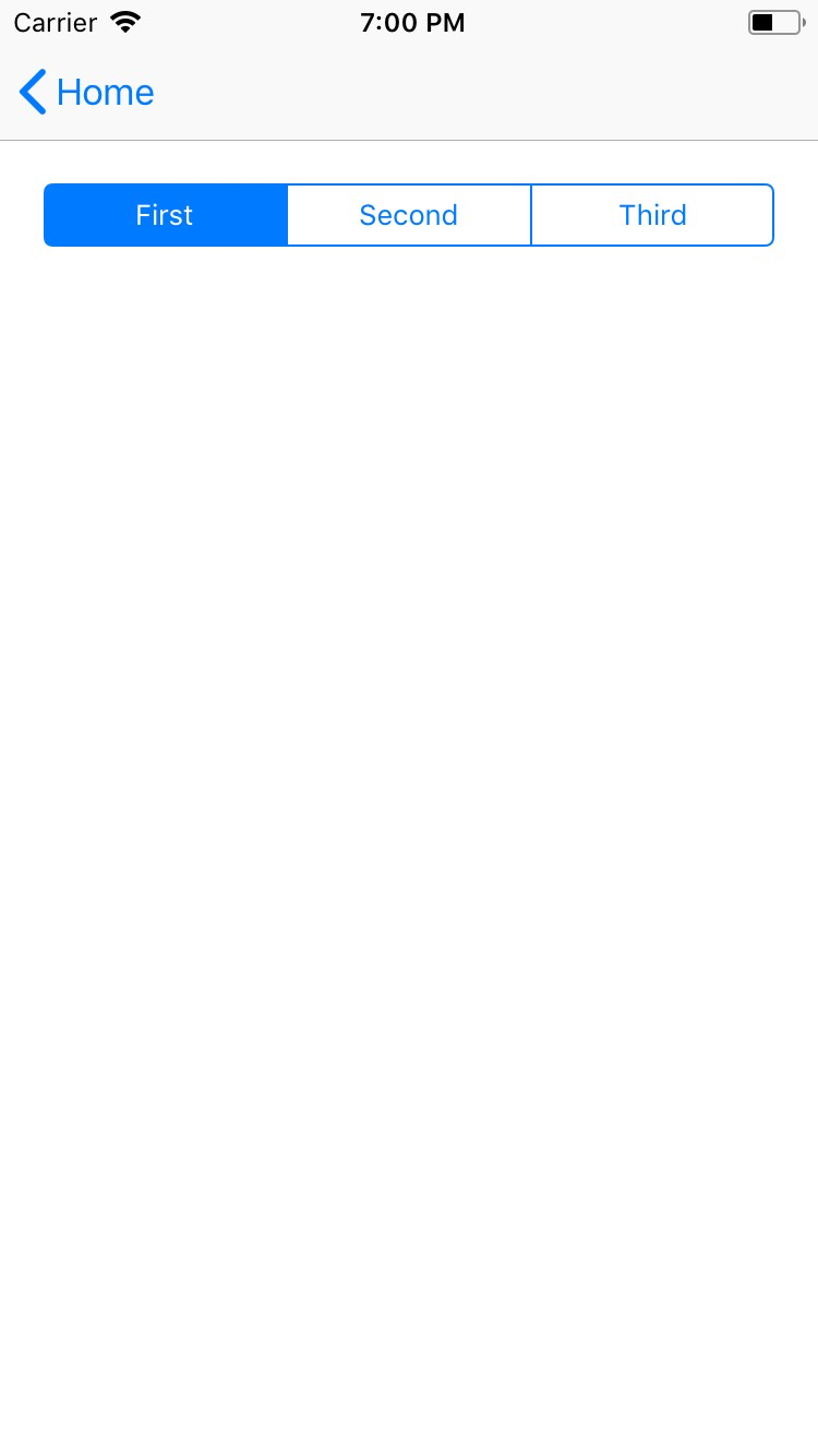
SegmentedBar
This is an overview of the most common usage of SegmentedBar. For more information about the available properties, methods, or events, head over to the complete API documentation for SegmentedBar.
<SegmentedBar> is a UI bar component that displays a set of buttons for discrete selection. Can show text or images.
As opposed to <TabView>:
- The position of
<SegmentedBar>is not fixed. - You can place and style it as needed on the page or inside additional app elements such as hamburger menus.
- You need to handle the content shown after selection separately.
<SegmentedBar>
  <SegmentedBarItem title="First" />
  <SegmentedBarItem title="Second" />
  <SegmentedBarItem title="Third" />
</SegmentedBar><SegmentedBar :items="listOfItems" selectedIndex="0"
@selectedIndexChanged="onSelectedIndexChange" /><SegmentedBar> provides two-way data binding using v-model.
<SegmentedBar :items="listOfItems" v-model="selectedItem" />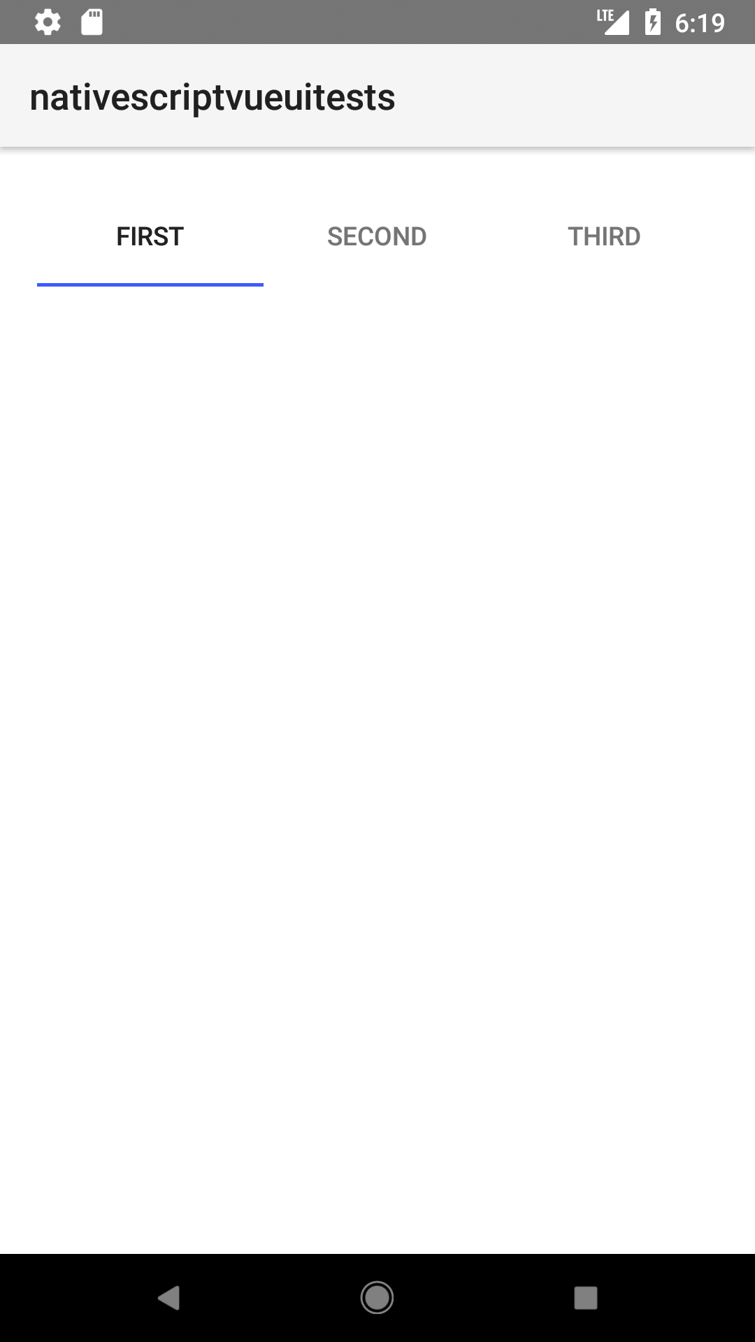
Props
| Name | Type | Description |
|---|---|---|
items | Array<SegmentedBarItem> | An array of items to be displayed in the segmented bar. Represents the button labels or icons of the segmented bar. The array must be created in advance. |
selectedIndex | Number | Gets or sets the index of the selected item. |
selectedBackgroundColor | Color | (Style property) Gets or sets the background color of the selected item. To set the background color of the entire bar, use backgroundColor. |
Events
| Name | Description |
|---|---|
selectedIndexChanged | Emitted when the an item on the segmented bar is tapped. |
Native component
| Android | iOS |
|---|---|
android.widget.TabHost | UISegmentedControl |
Contributors