

- elements:utilities
- introduction
- getting-started
- routing
- utilities
- elements:layouts
- elements:action-bar
- elements:components
- elements:dialogs
- elements:utilities
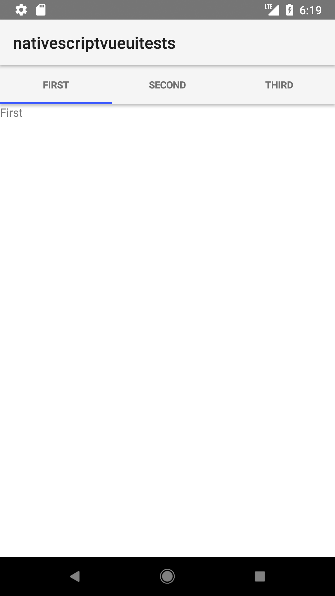
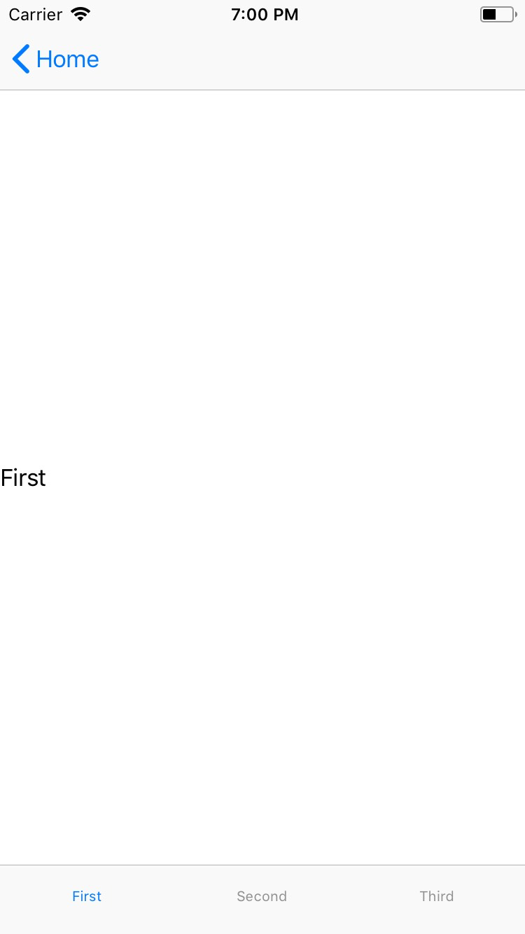
TabView
This is an overview of the most common usage of TabView. For more information about the available properties, methods, or events, head over to the complete API documentation for TabView.
<TabView> 是一个导航组件,显示分组到选项卡的内容,并允许用户在选项卡之间切换。
<TabView :selectedIndex="selectedIndex">
  <TabViewItem title="Tab 1">
    <Label text="Content for Tab 1" />
  </TabViewItem>
  <TabViewItem title="Tab 2">
    <Label text="Content for Tab 2" />
  </TabViewItem>
</TabView>
注意: 目前, TabViewItem 需要一个子元素。在大多数情况下,您可能希望将内容包装在布局中。
向标签添加图标
<TabView :selectedIndex="selectedIndex" iosIconRenderingMode="alwaysOriginal">
  <TabViewItem title="Tab 1" iconSource="~/images/icon.png">
    <Label text="Content for Tab 1" />
  </TabViewItem>
  <TabViewItem title="Tab 2" iconSource="~/images/icon.png">
    <Label text="Content for Tab 2" />
  </TabViewItem>
</TabView>
注意: 使用图像作为选项卡图标而不是图标字体。
道具
| 名称 | 类型 | 描述 |
|---|---|---|
selectedIndex | Number | 获取或设置当前选定的选项卡。默认是 0。 |
tabTextColor | Color | (Style属性)获取或设置选项卡标题的文本颜色。 |
tabBackgroundColor | Color | (Style属性)获取或设置选项卡的背景颜色。 |
selectedTabTextColor | Color | (Style属性)获取或设置所选选项卡标题的文本颜色。 |
androidTabsPosition | String | 设置TabView在Android平台中的位置 有效值: top 或 bottom |
活动
| 名称 | 描述 |
|---|---|
tabChange | <TabViewItem> 轻敲其中一个组件时发出。 |
原生组件
| Android | iOS |
|---|---|
android.support.v4.view.ViewPager | UITabBarController |
Contributors
